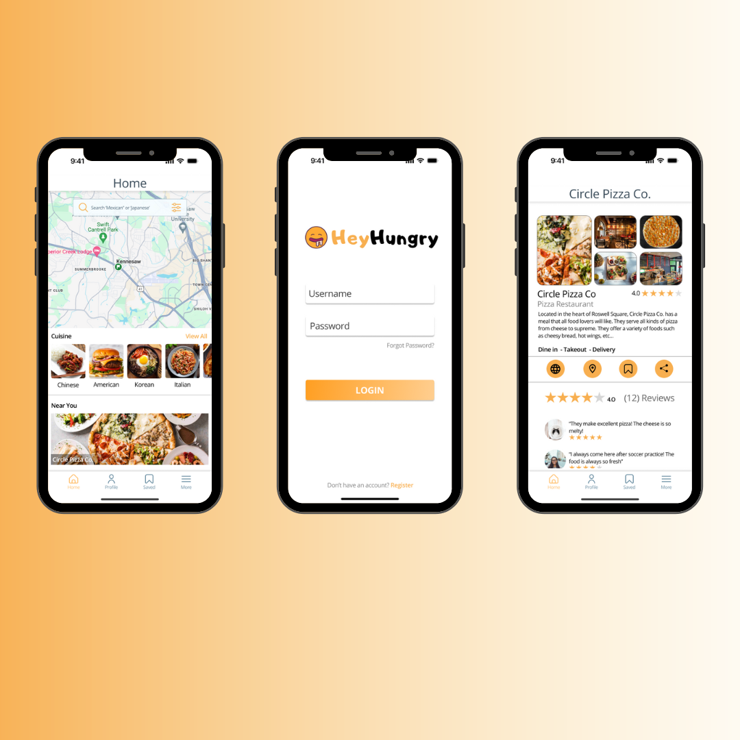
HeyHungry
A mobile app prototype designed to help indecisive people find a place to eat
Project Overview
HeyHungry is a mobile app prototype designed to help indecisive individuals find a place to eat by letting them filter their restaurant options. When individuals go out to eat with friends and family, many times they cannot reach a consensus on where to dine. But, with with HeyHungry, users can effortlessly access a curated list of personalized restaurant recommendations.
Method
For this project, our team used Lean UX that allowed us to iteratively design and test our assumptions to develop the design for our prototype in an efficient and productive manner.
Goals
Enable the user to filter their options.
Let users design and customize their profile
Leave reviews for restaurants

Sprint 1 : Week 0
Sprint 1
In Lean UX, Week 0, typically involves activities that set the stage for the design and development process. It's a foundational phase that focuses on understanding the project, defining goals, and aligning the team.
Proto-Personas
Hypothesis Prioritization Table
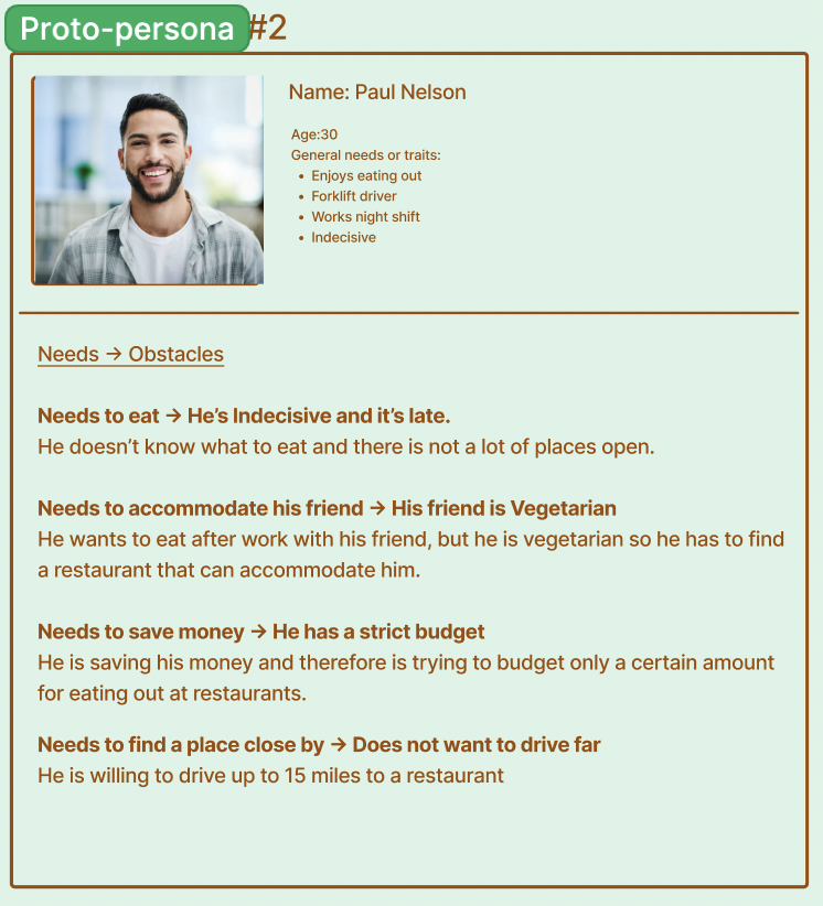
Lean UX Canvas (Week 0)Proto-Personas are created early in the design process when there might be limited information available about the target audience. They serve as placeholders until more comprehensive user research can be conducted. We started with two proto-personas, Paul, a 30 year old forklift driver who goes out to eat often with his co-workers, and Teri, a 23 year old college student who is vegan and eats out often with her friends.
Proto-Persona PaulA hypothesis prioritization table is a tool used to organize and prioritize various hypotheses related to user experience (UX) and product development. The hypothesis prioritization table will help out team identify and prioritize assumptions and hypotheses about user behavior, product features, and other factors. The sticky notes on the upper far right hand corner (Quadrant I) are the hypotheses that have the promise of a big return but also pose significant risks. These are the hypotheses that we will focus on experimentation. The sticky notes on the upper left hand corner (Quadrant II) are hypotheses that we have high confidence and a strong belief that they will deliver customer and business value, once we build, launch, and measure them. But, we will not spend time on discovery here.
Backlog
User Interview #1Insights from Sprint 1: Week 1
Sprint Retrospective
Testing Low-Fidelity Mockups
Hypothesis Prioritization Table Product BacklogProto-Persona TeriOnce we completed our Lean UX canvas we created our backlog, which had features that we wanted to test during Sprint 1. We chose these features based on what we thought had the highest value but also the highest risk associated. We wanted to prioritize testing whether or not people preferred a generated list of restaurants or just a single restaurant recommendation. We also wanted to know what the most important factors (ex: price, ratings, distance etc…) were for people when deciding on where to eat at.
Sprint 1 : Week 1
During Sprint 1, Week 1, my team conducted 3 user interviews and held three stand-ups—a team meeting to discuss tasks and assess current progress. During our stand-ups, we discussed MVPs (Minimum Viable Products) which are widely adopted in various product development processes, including Lean UX. The goal of creating an MVP is to quickly bring a basic version of a product to market, allowing designers and developers to gather valuable user feedback and learn from real user interactions. Our MVPs were the features from our product backlog.
User Interviews
We interviewed 3 individuals and we were primarily focused on learning about their thought process when deciding on what restaurant to eat at. We asked them questions such as “Do you use any apps to help you find a place to eat? If so, what do you like about the app and what do you not like about the app?”
Affinity Mapping
Immediately following each of the interviews, our team completed affinity mapping exercise in FigJam. To do this, each team member spent up to 10 minutes writing out all observations, questions, and notes regarding the interview. Then, we highlighted patterns between each person interviewed. This helped the team condense research findings and establish majority observations early on in the design process. This mapping exercise can be found below.
Affinity MappingUser Interview #2All 3 of our users said that they were indecisive when it comes to choosing a restaurant, and often times struggle to come to a consensus on where to eat.
When we asked users how they felt about HeyHungry being on a web browser, all of them said that they would prefer the prototype to be accessible on a mobile device.
Users said that distance and price were the two important factors when choosing a restaurant.
At the end of Sprint 1, Week 1 we completed a Sprint Retrospective, which is a board where we responded to the following questions: “What went well? “What could have gone better? “What will we try next?” During this meeting we were able to reflect on Sprint 1 and how we were going to approach Week 2. We decided that we were ready to shift our testing to show our interviewees low-fidelity screens as well as introduce usability testing as the interviews continued.
Sprint 1 : Week 2
Sprint RetrospectiveDuring Sprint 1, Week 2, my team conducted 3 user interviews and held three stand-ups. At the end, we once again completed the sprint retrospective. This week we were ready to test out some low fidelity mockups and gather some information about the prototype’s information architecture.
During our interviews we wanted to see whether or not the users liked having a series of questions about their eating preferences every time they would use the app. We quickly discovered that users found it frustrating having to take a questionnaire every time that they would open the app. This discovery made us realize that we had to come up with a different approach in Sprint 2. We also learned that users liked having access to reviews, and they actually place more emphasis on reviews when they were visiting a restaurant for the first time.
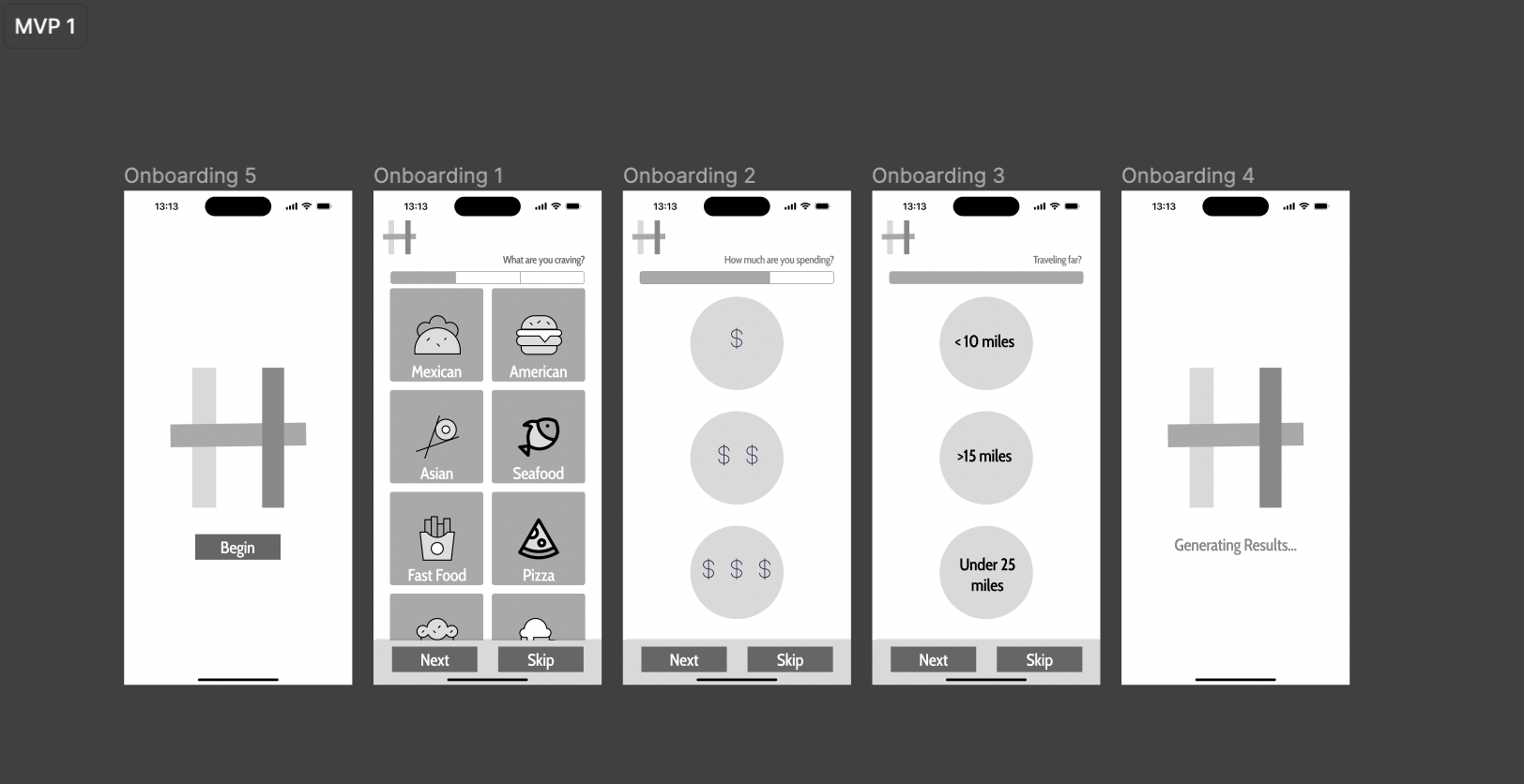
Low Fidelity Mockup on Figma
Usability TestingSprint 2 : Week 0
Proto-Personas
Sprint 2
During Sprint 2, Week 0, we had multiple meetings in order to see if we needed to revalidate our Lean UX Canvas (We needed to see if anything changed and if there was anything we had to fix based on our findings from Sprint 1).
Based on our interviews from Sprint 1, we decided to eliminate Teri, the 23 year old college student who is vegan and eats out often with her friends. We focused solely on Paul, the 30 year old forklift driver who goes out to eat often with his co-workers. Many of the interviewees stated that price was their determining factor when deciding where to eat at. So, we would shift our focus on this in Sprint 2, Week 1.
Some of the features on our hypothesis table were invalidated by testing in Sprint 1, such as having users answer a series of questions every time they want to find a restaurant. We then had to change our hypothesis table and edit our Sprint 2 backlog. This backlog incorporated features we thought had high value that needed testing, such a price point slider and a map feature. These two features would become our main MVPs during this Sprint Cycle. We decided to test an interactive map feature on the home page, as well as an interactive slider where users can choose their own price range.

Sprint 2 : Week 1
Sprint 2, Week 1 started off with my team and I testing a high-fidelity prototype of our app. During the first couple of interviews we showed users the interactive map feature and asked them how they felt about it (Did they like it?, Was it confusing?, Was it easy to use?). All of the users liked the feature, and they thought it was convenient because distance played a major role in deciding where to eat. So, we decided to keep this feature. We then proceeded to ask them how they felt about the price slider. All of the users interviewed stated that it was easy to use and it helped them narrow down their search.
User Interview #9User Interview #11Sprint 2 : Week 2
Sprint 2 started off with my team and I testing a pop- up which asked the user whether or not they have any dietary restrictions because some of our users stated that they often have to find accommodations for friends with dietary restrictions. We also needed to find out if our user flow made sense, and so we went ahead and tested that out as well.
Usability TestSprint Retrospective
User Interview #10We held a Sprint Retrospective meeting at the end of Sprint 2 to reflect on everything we had accomplished so far and what we needed to tackle during the refinement stage. Our proto-persona, Paul, stayed relatively the same, so no major changes were made with him.
Refinement
After Sprint 2, we spent a week refining and making some final changes. We used this time to ensure we followed an 8pt grid, used colors from our color palette and text styles. We also made sure that the icons we used were consistent and users knew what they symbolized.
Backlog

Introducing…
Hey Hungry, an app that helps users find a place to eat
A profile page that gives you access to your own reviews on restaurants
A dashboard where you can choose the category of food you want, distance and price

You can save restaurants to your profile and view reviews from others
Takeaways
Following an 8-pt grid is a common design convention that should be followed from the beginning of the design process.
Working collaboratively and efficiently as a team helps reach your goals much faster than you would on your own.
Usability testing is an important part of the design process because you need other perspectives.
The design process is an iterative process, and you will always find places for improvement.
Not everything is going to be perfect and that is okay!